Brown Holmes: A Playful Display Font for Friendly Digital Brands
It started with a hero section—just me, a new client brief for a small creative coaching website, and an open Figma file. The vibe was warm, human-centered, and intentionally unpolished—not corporate, but confident. I needed a headline font that felt like a friendly invitation, not a sales pitch. That’s when I dropped Brown Holmes into the mockup.
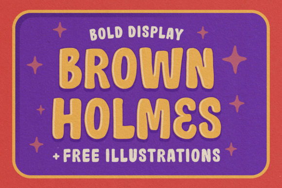
Right away, it clicked. Brown Holmes is a chunky, hand-drawn display font with uneven baselines, slightly rounded terminals, and generous letter spacing. It’s not trying to be perfect—and that’s its strength. It reads as joyful, approachable, and authentically handmade. Think crayon sketches on a classroom whiteboard, but refined enough for digital use. As a display font, it’s built for impact, not long paragraphs. Its personality sits comfortably between playful and trustworthy—ideal for brands that want to feel human first.
I tested it across real layout scenarios: over a soft gradient banner, beside minimalist sans serif body text, and stacked in a responsive hero on mobile. On desktop, Brown Holmes shines at 48–64px for main headlines. On mobile, I scaled it down to 36px with tighter tracking—and it held up surprisingly well. The thick strokes and open counters kept it legible even at smaller sizes, especially against light backgrounds. Over darker or image-heavy overlays, I added a subtle white stroke (via CSS text-stroke) rather than relying on heavy shadows—cleaner, lighter, and more performant.
Where does Brown Holmes work best? Not everywhere—but exactly where you need warmth and character. I used it for the primary headline (“Your Creative Confidence Starts Here”), the “Book a Discovery Call” CTA button (in all caps, at 24px), and the section divider before testimonials (“What Learners Say”). It didn’t go in the navigation, footer, or paragraph copy—that’s where a clean sans serif like Inter or Poppins took over. That contrast created visual hierarchy without visual noise. Users scanned faster, lingered longer on key messages, and reported the page feeling “more like talking to a person.”
It’s also a natural fit for other digital touchpoints: a boutique online store’s seasonal sale banner (“Summer Sketch Kits — In Stock!”), a portfolio site’s project title cards, or a course landing page’s module headers (“Week 3: Playful Prototyping”). Because Brown Holmes is a display font—not a text or UI font—it works best for short, high-impact phrases. Avoid using it for form labels, pricing tables, or multi-line feature lists. Its charm lives in brevity.
Readability in context matters. On mobile, I checked line height (1.2), letter spacing (+0.03em), and contrast ratio (4.9:1 against #F9F7F3—well above WCAG AA). It passed. But I wouldn’t use it on dark mode interfaces without testing contrast carefully—its medium weight can soften against deep charcoal or navy. For image overlays, I reserved Brown Holmes for areas with ample negative space or blurred background zones, never over busy textures.
Font pairing is where Brown Holmes truly sings. I paired it with Inter (variable) for body copy and captions—neutral, highly readable, and free via Google Fonts. The contrast between Brown Holmes’ expressive shapes and Inter’s geometric clarity reinforced the brand’s dual focus: creativity + clarity. For a more editorial or craft-focused variation, a warm serif like Literata or Crimson Pro would add sophistication without competing. The key is keeping supporting typefaces quiet—let Brown Holmes lead, then step back.
Before deploying, I double-checked practical details. Brown Holmes comes in one weight (Regular) with standard Latin character support, basic punctuation, and no italics or bold variants. That’s fine for display use—but means no stylistic fallbacks for emphasis. It’s available as WOFF2 (optimized for web), includes OpenType features like ligatures and alternate glyphs, and carries a commercial license suitable for client websites, SaaS dashboards, and digital product kits. No surprises at handoff: no missing accents, no rendering hiccups in Safari or Edge, and no licensing red flags for e-commerce banners or email headers.
I also considered how it supports broader brand consistency. Used once in the hero and again in a testimonial pull quote, Brown Holmes became a subtle throughline—not repetitive, but recognizable. That kind of intentional repetition builds familiarity without monotony. It’s not a logo font (too informal for standalone branding), but it *is* a voice font—the typographic equivalent of tone of voice in writing.
For blog headers or social media graphics, Brown Holmes adds instant personality. I exported a few SVG headings for Instagram carousels and found they loaded instantly—even with embedded fonts disabled. For digital brand kits, it pairs beautifully with soft color palettes (terracotta, oat, sage) and simple icon sets. It doesn’t shout; it smiles. And in a landscape full of sleek, ultra-thin, or overly technical fonts, that smile stands out.
One final note: Brown Holmes isn’t about trend-chasing. It’s about intention. If your digital experience values authenticity over polish, warmth over uniformity, and humanity over automation—then this display font earns its place. It won’t fix weak copy or poor UX flow. But when placed thoughtfully—in the right size, with the right contrast, alongside the right supporting type—it helps users feel seen before they’ve even scrolled.
That’s the quiet power of a well-chosen display font. Not decoration. Direction.